
A little while ago a startling graphic which showed sea ice decline. It got retweeted by the UN, Al Gore started using it and even the Daily Mail wrote an article
It turns out the creator of this animation, and others, lives right here in Manchester. His name is Kevin Pluck, and he kindly agreed to an email interview with Manchester Climate Monthly.
1. Could you say a little bit about your background, and how you came to have the skills to be making these graphics?
I’m originally from NZ and have lived in the UK for 16 years now. I have over 17 years professional software development but have only started making animations in the last couple of years.
2. Can you remember when you first understood about climate change? Was it a sudden or gradual process? Was it related to a book, film, individual, event?
I recall as a teenager in the late 80’s discussing with an adult that it’s their generation’s fault about, I think, the ozone hole as it was a big deal in NZ at the time. It was also a time of anti-nuclear sentiment especially with nuclear free NZ in which US nuclear war ships were not allowed to enter NZ waters.
3. When did you decide to start making graphics? Did the first one(s) take longer?
I started about two years ago making mathematical videos as I was fiddling with prime numbers and seeing if I could find patterns
I watched this video about spiral galaxies:
I was intrigued as to what the star motion would look like so made this animation which was quite satisfying:
Which was quite popular, even the professor in the original video liked it.
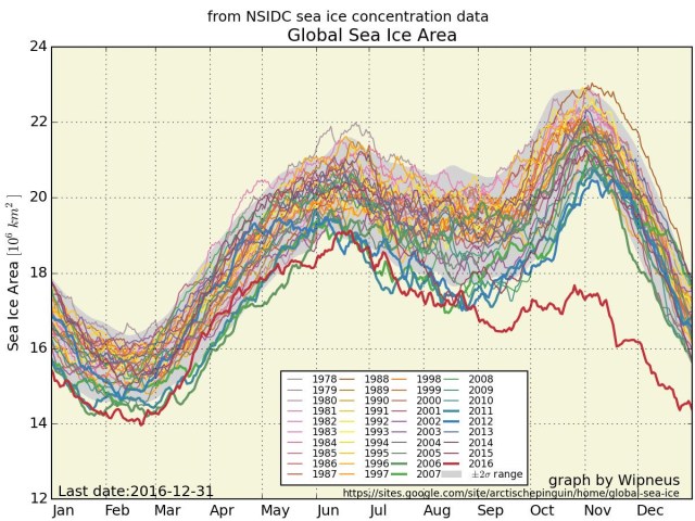
In January of this year I stumbled across this graph of sea ice.
I figured I could use the techniques developed in the above animations to bring it to life. Earlier I had admired Professor Ed Hawkins climate spiral animation; https://www.climate-lab-book.ac.uk/2016/spiralling-global-temperatures/

and thought that format would work well with this data.
The animation I produced: https://twitter.com/kevpluck/status/817126011435446273
This was very popular on reddit and on twitter where it got retweeted by the UNFCCC, Greenpeace and I got an email from the office of Al Gore asking for permission to use it in his talks. Even the DailyMail wrote a piece:
I steadily improved that animation with each monthly update adding rings for the Arctic and Antarctic and incorporated global temperature as a colour https://twitter.com/kevpluck/status/928031882427682816
After a discussion about the possible distortions a spiral graph could have, I animated a barrel graph which, much to my surprise, I seem to have invented. I got the idea from thinking about seismic drum recorders. They are really good at showing seasonal data as here:
https://twitter.com/kevpluck/status/925480147146498048
and also for showing that the data doesn’t have a seasonal pattern as in the co2 and global temperature animation
4. What has the been reaction to the graphics? What has surprised you, gratified you?
The reaction has been very positive with only a handful of deniers raising their head above the parapet. (Perhaps I’m in a lefty green echo chamber) but it was certainly a surprise when the UN retweets you and emails from Al Gore etc! Also a surprise to have invented a new form of graph! It’s the reaction from the climate scientists that is the most gratifying, I have hundreds of academics following me that have been making suggestions and using my animations in their talks.
5. Any advice for anyone trying to communicate climate change?
Be polite and relentless.
6. What next? Any plans to increase/decrease/change output?
No plans to decrease at all! I have a few ideas up my sleeve, next one is a way to show how much CO2 is in the atmosphere and how much it has changed in a way that’s easy to grasp. I’m also working on a project that will try to centralise climate data and produce it in a standard format so that obtaining data is far simpler.
7. Anything else you’d like to say?
Keep it in the ground!

